INFOGRAPHIC: Breaking Down the Numbers Behind "Fake News"

 Thomas A Hawk
Published: 27 Feb, 2018
1 min read
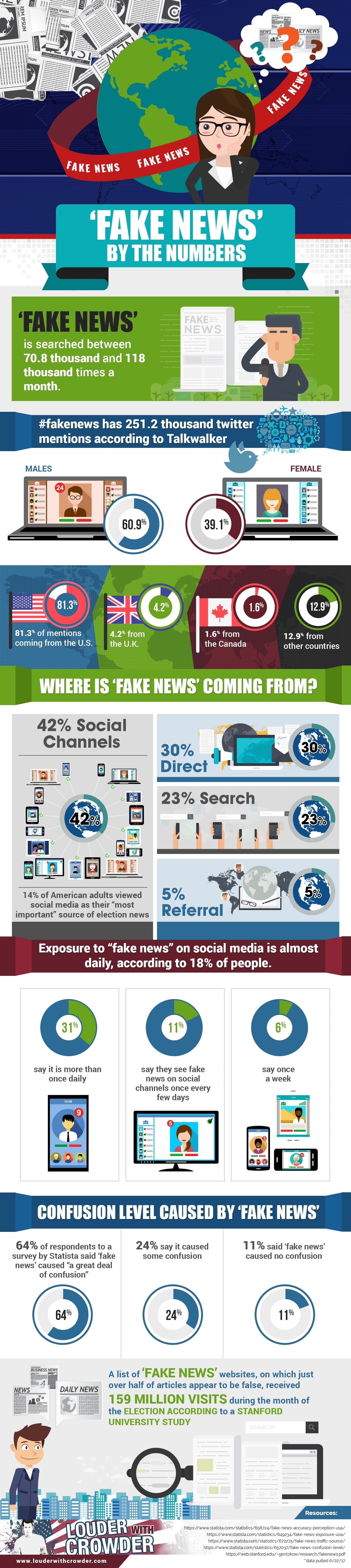
The folks at "Louder with Crowder," a conservative-leaning website, might elicit mixed emotions for their headlines. However, they have released a rather interesting infographic on the dominance of "fake news" since the 2016 presidential election -- an issue compounded by the public's heavy use of social media.
The following infographic breaks "fake news" down by the numbers, looking at online statistics and survey results on how the public has reacted to fake news:
Editor's Note: The infographic originally published on Louder with Crowder here.
You Might Also Like

Why We Call Ourselves Independent Voter News
For 15 years, we have published more than 14,000 articles written by people from different walks of life, different parts of the country, and different political backgrounds....
01 Apr, 2026
-
2 min read

New IVP 2026 California Governor Poll: What the Toplines Don’t Tell You
Using verified California voter file data, IVP surveyed high-propensity voters from February 13 through 20. The poll tested first-choice ballot preferences alongside issue intensity on affordability and the cost of living, immigration enforcement, more choice reform, and more....
23 Feb, 2026
-
10 min read

81% of Americans Say Money Controls Politics – Can a Constitutional Amendment Fix It?
Polls consistently show that nearly all Americans across the political spectrum agree that there is too much money in politics – whether from foreign sources, corporations, or so-called “dark money” groups. ...
23 Feb, 2026
-
13 min read