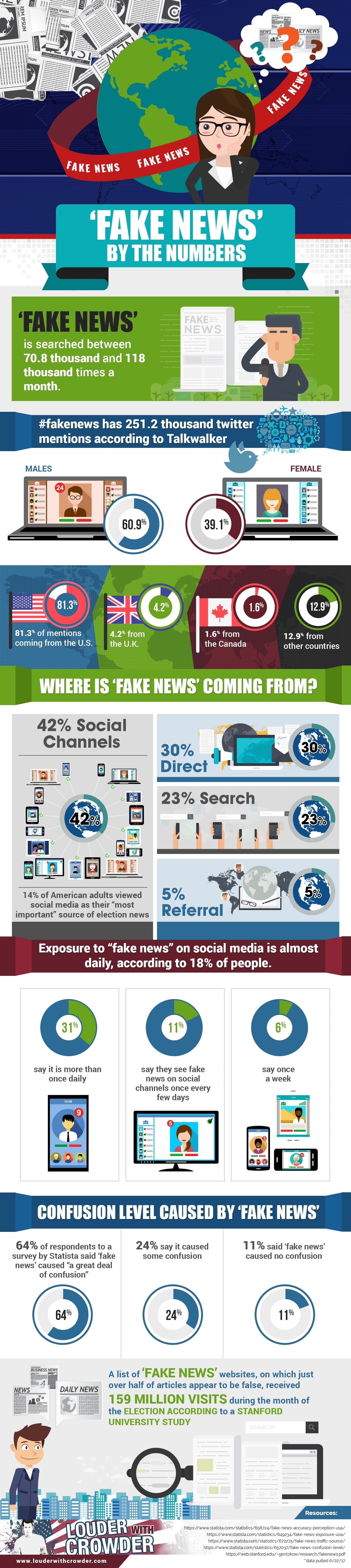
The folks at "Louder with Crowder," a conservative-leaning website, might elicit mixed emotions for their headlines. However, they have released a rather interesting infographic on the dominance of "fake news" since the 2016 presidential election -- an issue compounded by the public's heavy use of social media.
The following infographic breaks "fake news" down by the numbers, looking at online statistics and survey results on how the public has reacted to fake news:
Editor's Note: The infographic originally published on Louder with Crowder here.