INFOGRAPHIC: Breaking Down the Numbers Behind "Fake News"

Author: Thomas A Hawk
Published: 27 Feb, 2018
●
Updated: 17 Oct, 2022●
1 min read
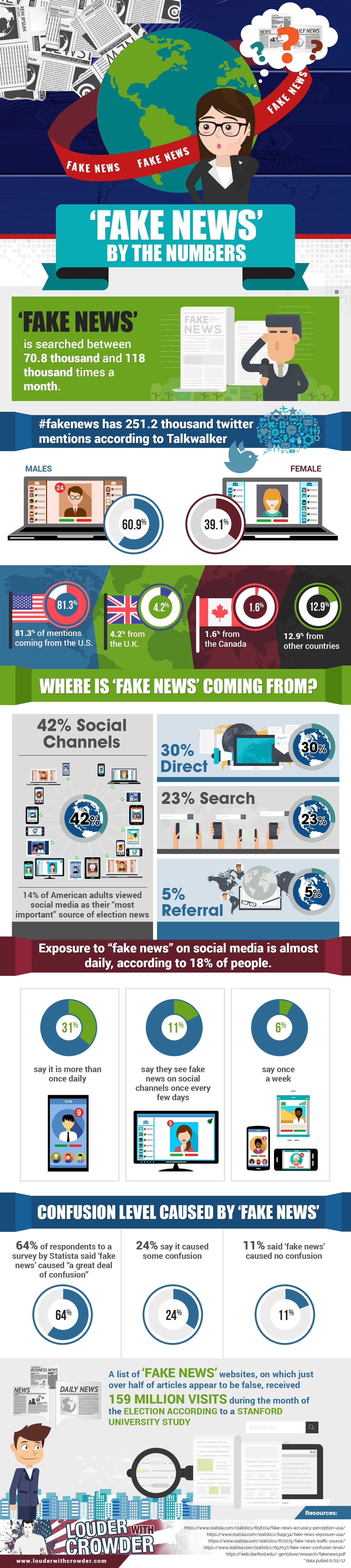
The folks at "Louder with Crowder," a conservative-leaning website, might elicit mixed emotions for their headlines. However, they have released a rather interesting infographic on the dominance of "fake news" since the 2016 presidential election -- an issue compounded by the public's heavy use of social media.
The following infographic breaks "fake news" down by the numbers, looking at online statistics and survey results on how the public has reacted to fake news:
Editor's Note: The infographic originally published on Louder with Crowder here.
Latest articles

Mike Tyson Calls Out Donald Trump to Make Good on Cannabis Rescheduling Promise
Mike Tyson, the former heavyweight boxing champion known as “Iron Mike,” is calling on President Donald Trump to make good on a campaign promise to reclassify cannabis under federal law....
11 Jul, 2025
-
2 min read

Texas, Football, Bobcats, Pac-12, and a Corrections Officer Who Performed a Miracle
Houston Chronicle and Hearst Newspapers Spotlight Kelly Damphousse, a Former Correctional Officer Who Transformed a University....
10 Jul, 2025
-
4 min read

Lorena Gonzalez, California’s Top Labor Leader, Blasts ‘Anti-Labor Left’ Over Abundance Movement
Lorena Gonzalez, one of California’s most influential labor leaders, entered the fray this week in a growing Democratic debate over the so-called “abundance” movement. ...
09 Jul, 2025
-
2 min read