INFOGRAPHIC: Breaking Down the Numbers Behind "Fake News"

 Thomas A Hawk
Published: 27 Feb, 2018
1 min read
The folks at "Louder with Crowder," a conservative-leaning website, might elicit mixed emotions for their headlines. However, they have released a rather interesting infographic on the dominance of "fake news" since the 2016 presidential election -- an issue compounded by the public's heavy use of social media.
The following infographic breaks "fake news" down by the numbers, looking at online statistics and survey results on how the public has reacted to fake news:
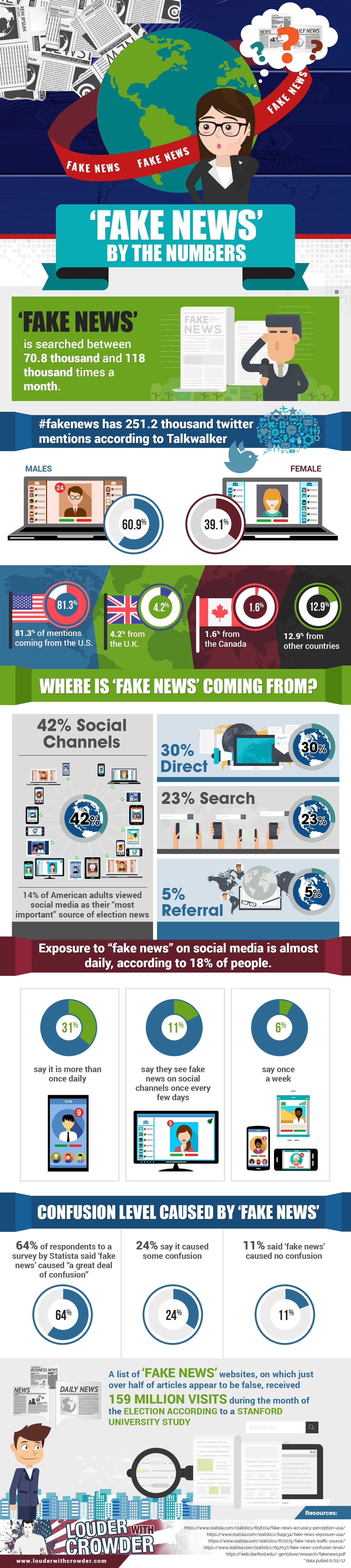
Editor's Note: The infographic originally published on Louder with Crowder here.
You Might Also Like
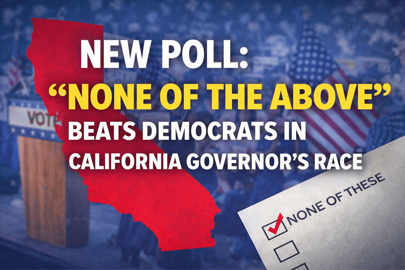
NEW POLL: California Governor’s Race Sees “None of the Above” Beat the Entire Democratic Field
A new statewide poll conducted by the Independent Voter Project finds California’s independent voters overwhelmingly support the state’s nonpartisan primary system and express broad dissatisfaction with the direction of state politics....
12 Jan, 2026
-
4 min read
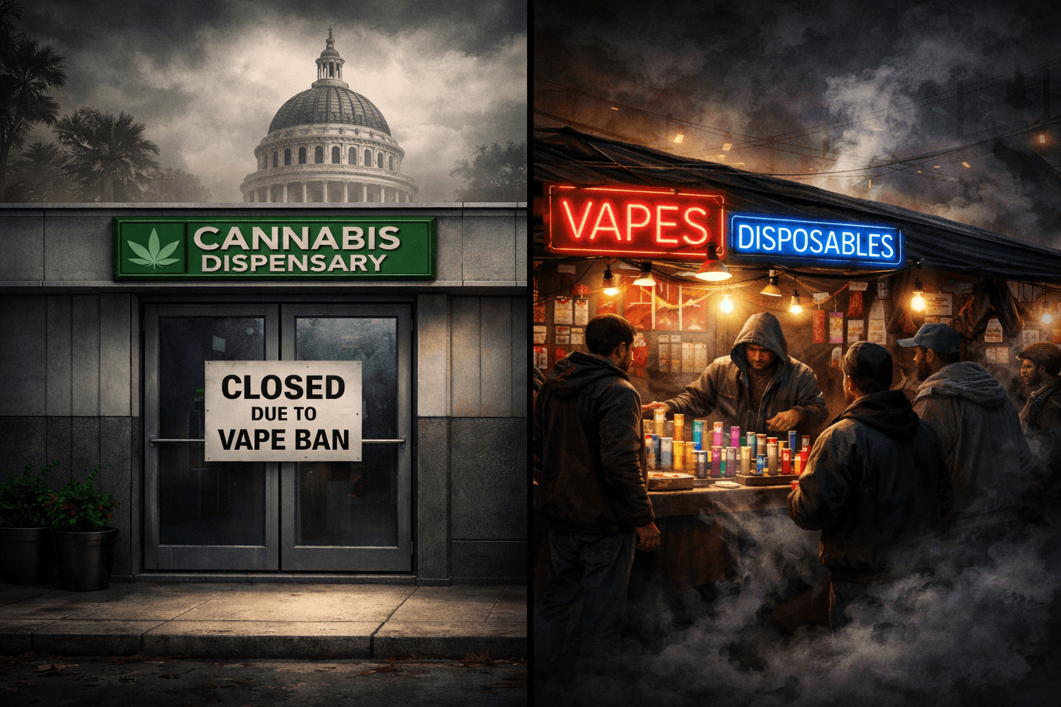
This California Disposable Vape Ban Could Devastate The Legal Cannabis Industry Even Further
Good intentions often make for compelling policy. But in practice, consequences rarely fall in line as neatly as the ideas that inspired them....
12 Jan, 2026
-
6 min read

Missouri Republicans Admit They Skewed Ballot Language to Protect a Rigged Map
Missouri state officials have pulled out all the stops to prevent a veto referendum from getting on the ballot that would overturn a mid-cycle gerrymander. This includes writing a ballot summary that makes it sound like the veto referendum is trying to protect gerrymandering in the state....
13 Jan, 2026
-
4 min read