Twitter Engagement Map Shows Obama Leading the Twitter War

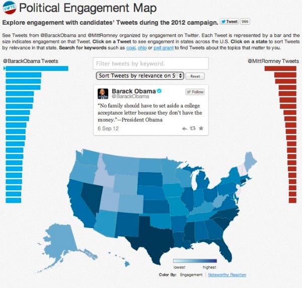
Thursday, Twitter launched a new interactive map aimed to provide users real-time data on the presidential candidates' most successful tweets. The Twitter engagement map allows users to click on a tweet from either Barack Obama or Mitt Romney and see how it ranked in terms of engagement in each state.
Tweets from the Twitter accounts of the presidential candidates @MittRomney and @BarackObama are organized based on the level of engagement of that tweet. Engagement can include a retweet, "favorite," or a reply. Each tweet is represented by a bar and the size indicates engagement on that tweet. The Twitter engagement map below reveals which states are interacting most with the candidates' tweets. The darker the shade, the higher the engagement:

The Twitter Engagement Map interestingly reflects the tones of both campaigns. On average, Obama's tweets engaged far more people than Mitt Romney's did and sparked higher levels of engagement nationwide. His most popular tweet was about education, followed by a tweet quoting Joe Biden on women's rights, two issues that have been central in his campaign. Obama's engagement levels are high in a number of states, specifically Wyoming, Nevada, Texas, an Florida.
Mitt Romney has struggled to keep up with Obama's levels of engagement, which is likely because he has significantly less followers and less frequent updates. In the last 24 hours, Romney has tweeted twice, compared to Obama's constant stream of campaign updates. Romney's most popular tweets were a remembrance of September 11, followed by a tweet that reads, "I am running for president to get us creating wealth again - not to redistribute it." Job creation has been a focal point in Romney's campaign message, and the attack on Obama's policies reflects the negative attitude of the campaign. Also important to note, both received the most engagement in the state of Utah, a state with a high population of Mormon voters.
The Twitter Engagement Map also lets you click on a state to sort the tweets and search for keywords to find tweets about topics that matter to you.
Check out the map here and let us know what you think!


