INFOGRAPHIC: Breaking Down the Numbers Behind "Fake News"

Author: Thomas A Hawk
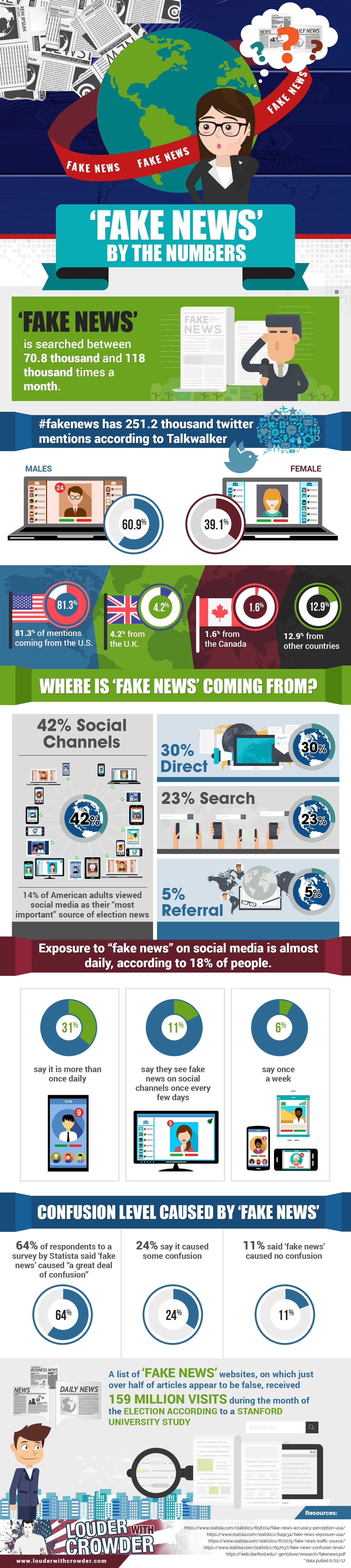
The folks at "Louder with Crowder," a conservative-leaning website, might elicit mixed emotions for their headlines. However, they have released a rather interesting infographic on the dominance of "fake news" since the 2016 presidential election -- an issue compounded by the public's heavy use of social media.
The following infographic breaks "fake news" down by the numbers, looking at online statistics and survey results on how the public has reacted to fake news:
Editor's Note: The infographic originally published on Louder with Crowder here.
Latest articles

Did the Major Party Campaigns Just End the Commission on Presidential Debates?
President Joe Biden’s campaign issued a challenge to former President Donald Trump Wednesday to two debates: One in June and one in September. The debates have to be hosted by a news outlet and will not be conducted in front of a crowd....
15 May, 2024
-
6 min read

Only 7% of Voters Have Returned Ballots in Oregon's Closed Primaries
Imagine being part of the largest segment of the registered voting population and being denied the right to an equal vote in elections. Well, millions of voters across the US don't have to imagine this because it is a reality for them in every election cycle. ...
14 May, 2024
-
3 min read

POLL: Nearly Two-Thirds of Chula Vista Voters Want to Change the Way They Vote
A recent poll conducted by Competitive Edge research with funding by More Choice San Diego found that 62% of voters in Chula Vista -- if given the opportunity -- would support a measure that would advance five candidates to a general election that uses ranked ballots....
13 May, 2024
-
2 min read